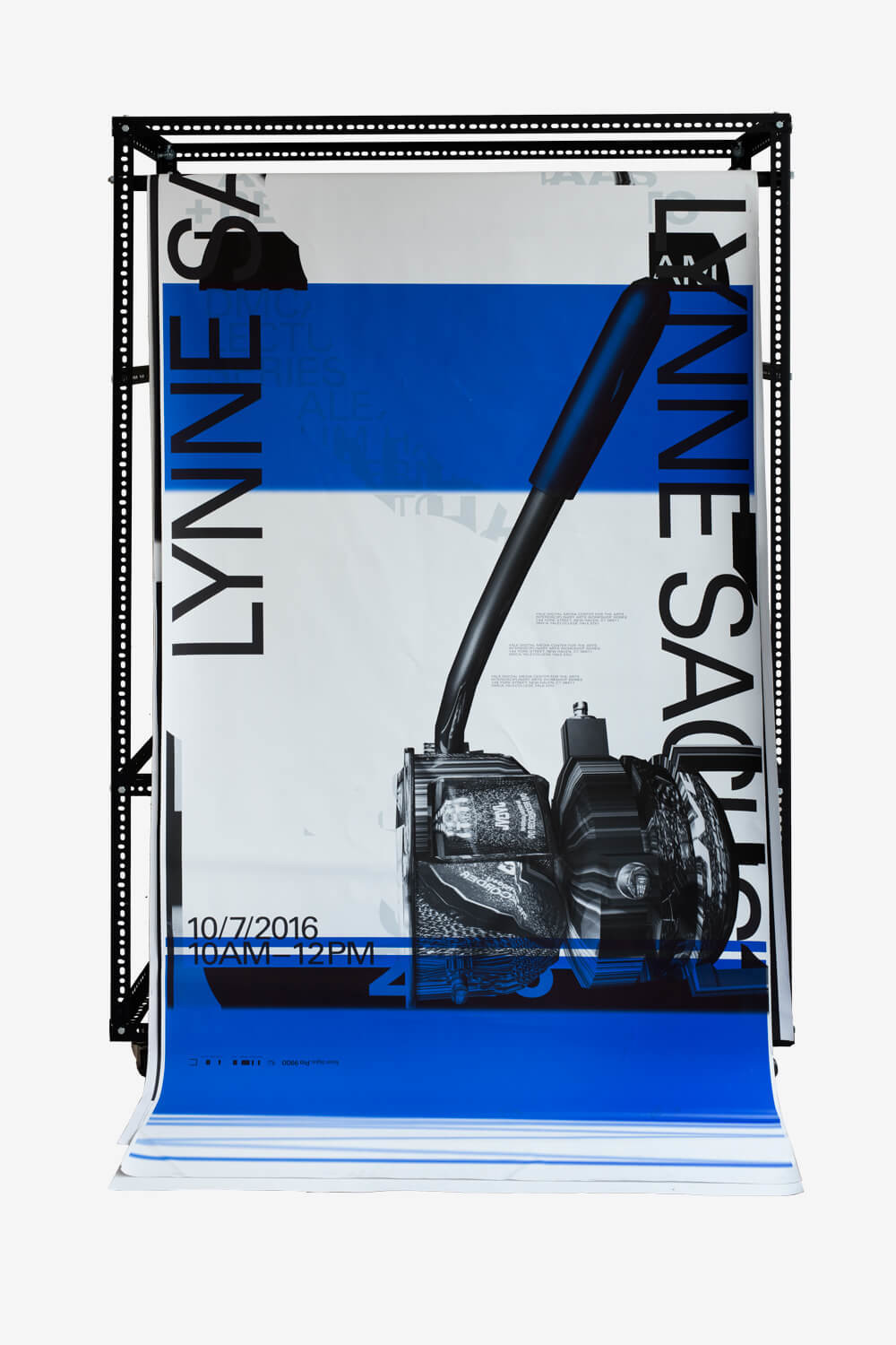
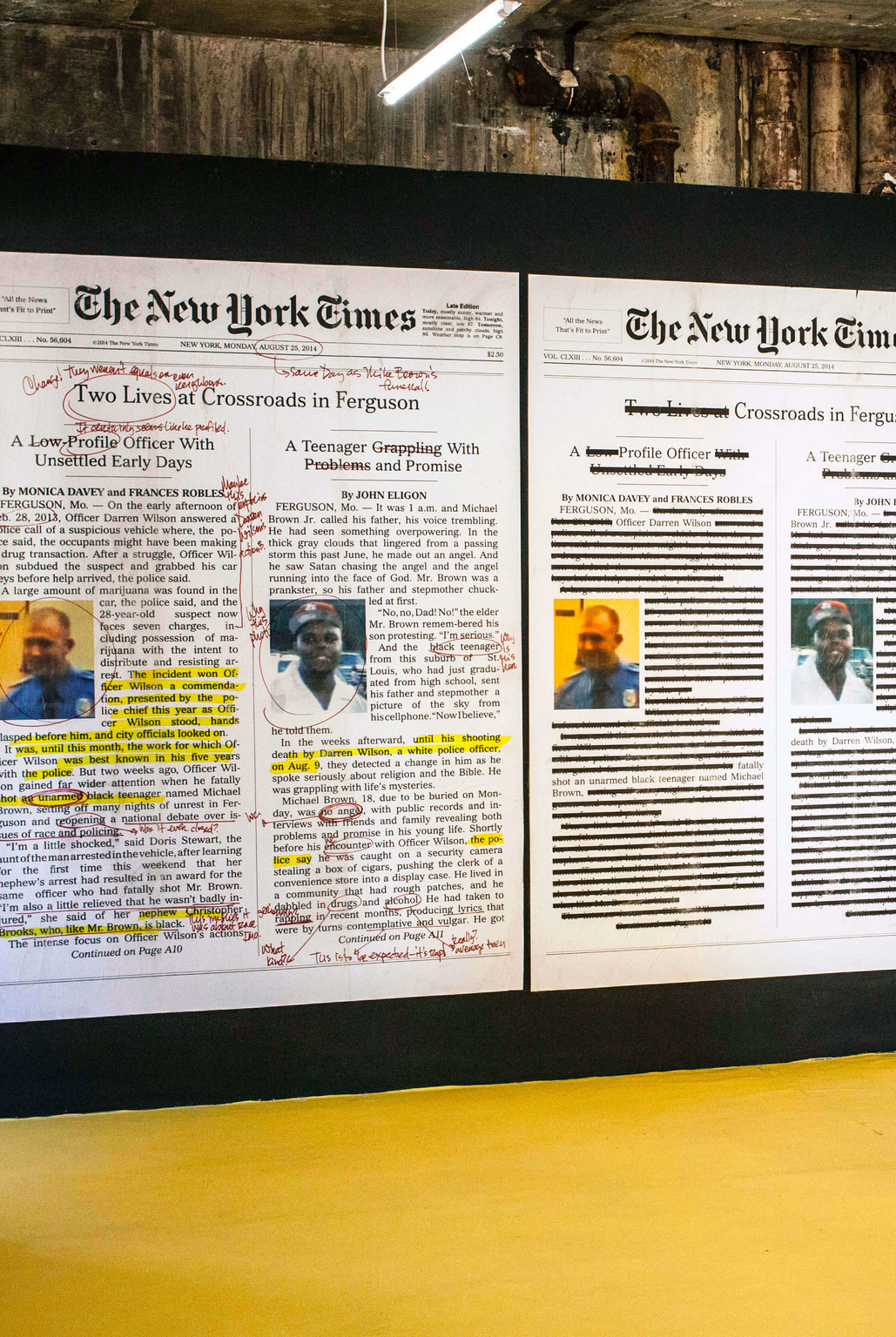
Who: Berlin-based graphic designer Pascal Storz and Leipzig-based graphic designer Fabian Bremer create books, magazines and visual identities in the contemporary art field.
When: The studio’s work was awarded second place in the Walter Tiemann Prize in 2016, was one of the Most Beautiful German Books 2016, won a Swiss Design Award in 2015, and was chosen as one of the Most Beautiful Swiss Books in 2011, 2012 and 2013.
Where: They are part of Spector Bureau, a collective of designers, artists and publishers, and work in close conjunction with Spector Books, the Leipzig-based art book publisher. They have worked with, among others, Nero Publications and the Heidelberger Kunstverein, and and are responsible for the art direction of the art magazine PROVENCE.
What: For Bremer and Storz it is important to be present from the early stages in the conception of the book. Their idea is to outline a general concept for the book that can be expanded to encompass further media, such as posters, exhibition displays and websites. As such, they sees themselves as a combination of author, translator, collaborator, builder, craft enterprise and mediator.
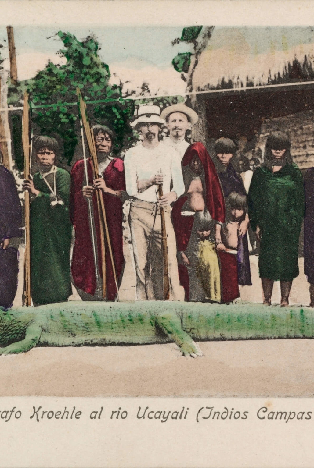
For Scrapbook of the Sixties, a collection of unpublished material by Jonas Mekas published by Spector Books in 2015, Bremer and Storz designed a sober three-column system to organise the heterogenous text material, structured with handwritten titles by Jonas Mekas. The fonts and material execution invite associations with the aesthetic of early American conceptual art and literature.
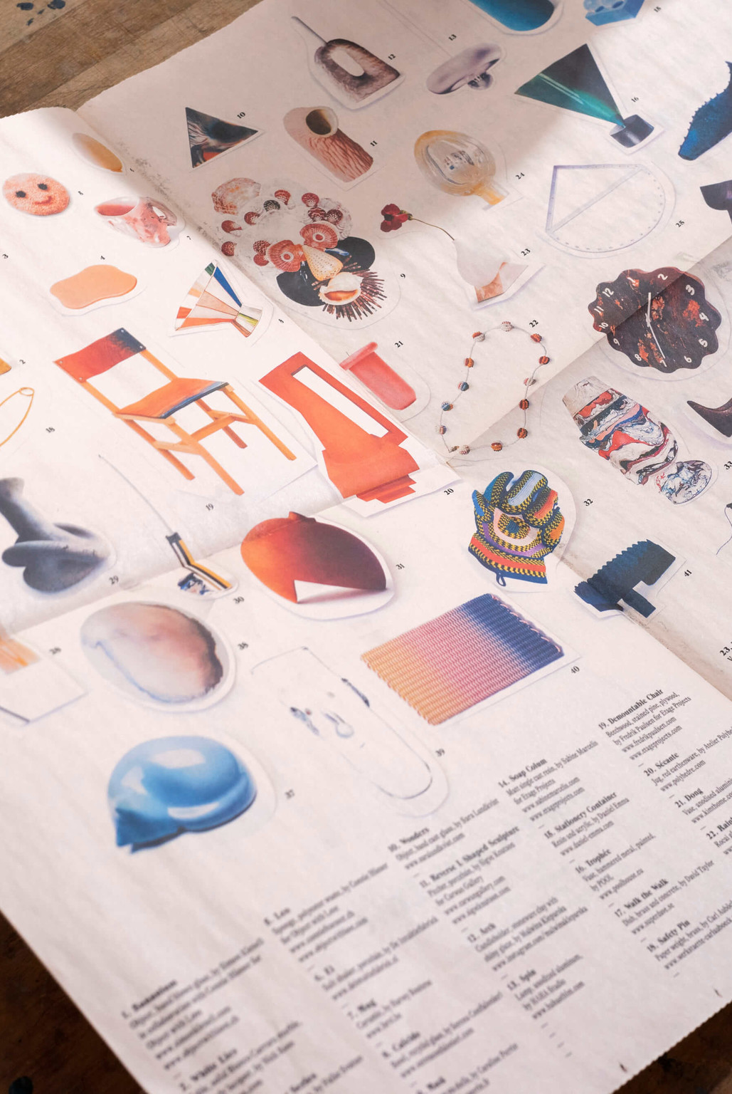
Sharing as Caring is the documentation of a series of exhibitions over five years at the Heidelberger Kunstverein. Every year, Miya Yoshida curates a new show, investigating further developments since the Fukushima catastrophe. The newspaper proved the most appropriate format to combine the identity of the Heidelberger Kunstverein with offering generous full spreads to the single positions of the exhibition.
Why: Bremer and Storz actually love black and white covers, relying visually on typographic features.


