Text by YVES METTLER
May 09, 2019
Designing Realities
Text by YVES METTLER
In anticipation of the Swiss Design Awards 2019 exhibition, I’d like to take you on a brief stroll among the participants, with an eye to the realities created by their research and production. As an artist myself, I’m intrigued by the way that design doesn’t just respond to problems by offering up innovative and original solutions, but actually creates a reality that is in the process of becoming, that has not yet been achieved, and that the object produced will help to realise. It’s a kind of narrative: the designer tells a “story” about how to solve a problem; but perhaps there’s a dimension that is even more closely related to reality, which I would venture to call “speculative realism”:I do not propose to discuss this term further here, even though it resonates with an idea that has recently shaken up the discourse of the contemporary art world. Simply put, speculative realism is a way of leveraging reality through a tool, an instrument or interface that entails a change in the relationship to the real. essentially, a real and contingent capacity for transformation that embraces the idea that things need not be as they are.
I therefore want to highlight a series of projects that I see as addressing these coming realities. This is, I believe, an important issue for us today, in a time of widespread concern about what the future holds. Far from being a source of inspiration as it was during the post-war boom years, today the future is — at best — something unknowable and — at worst — a vision of the apocalypse. It is as if we have little or nothing to look forward to. For myself, I believe that there are futures everywhere, scattered all around us. And we have to make the effort to envisage a multiplicity of them. What, then, are these futures that I see nestling among the broad range of design practices, these emerging presents that designers give form and push towards reality?
Dans l’attente de l’exposition des Swiss Design Awards 2019, je propose de cheminer parmi les participants avec, en tête, la question des réalités produites par leurs recherches et produits. De mon point de vue d’artiste, je suis attiré par la façon dont le design ne répond pas seulement à des problèmes en offrant des solutions innovatrices et originales mais produit une réalité en devenir, encore à atteindre et dont l’objet produit va engager la réalisation. On pourrait parler alors de Storytelling ; le designer « raconte » comment on peut résoudre un problème. Mais il y a peut-être une dimension encore plus articulée au réel. Je la conçois comme une forme de réalisme spéculatif,Terme que je ne vais pas plus expliquer ici, bien qu'il résonne avec une réflexion qui a récemment ébranlé le discours dans le monde de l'art contemporain. J'entends par réalisme spéculatif assez simplement une manière de faire levier sur une réalité par le truchement d'un outil, d'un instrument, d'une interface qui engage une modification du rapport au réel. essentiellement une capacité réelle et contingente de transformation, embrassant la thèse que les choses ne doivent pas être comme elle sont.
J’aimerais donc relever une série de projets où je peux distinguer une approche quant à ces réalités à venir. Il me semble que cela est pertinent et à relever aujourd’hui, dans la mesure où la question du futur produit plutôt de l’inquiétude. Loin d’être une source d’inspiration, comme pendant les Trente glorieuses, le futur est aujourd’hui, au mieux, ce que l’on ne peut pas connaître et, au pire, le mur de l’apocalypse. On dirait que nous sommes pauvres en futur. Or je pense que, de manière très dispersée, il y a des futurs de partout. Et il faut nous exercer à voir une multiplicité de futurs. Quels sont donc ces futurs que je vois nichés dans l’étendue des pratiques du design, des présents en devenir que ces designers mettent en forme vers le réel ?
For myself, I believe that there are futures everywhere, scattered all around us. And we have to make the effort to envisage a multiplicity of them.
Or je pense que, de manière très dispersée, il y a des futurs de partout. Et il faut nous exercer à voir une multiplicité de futurs.
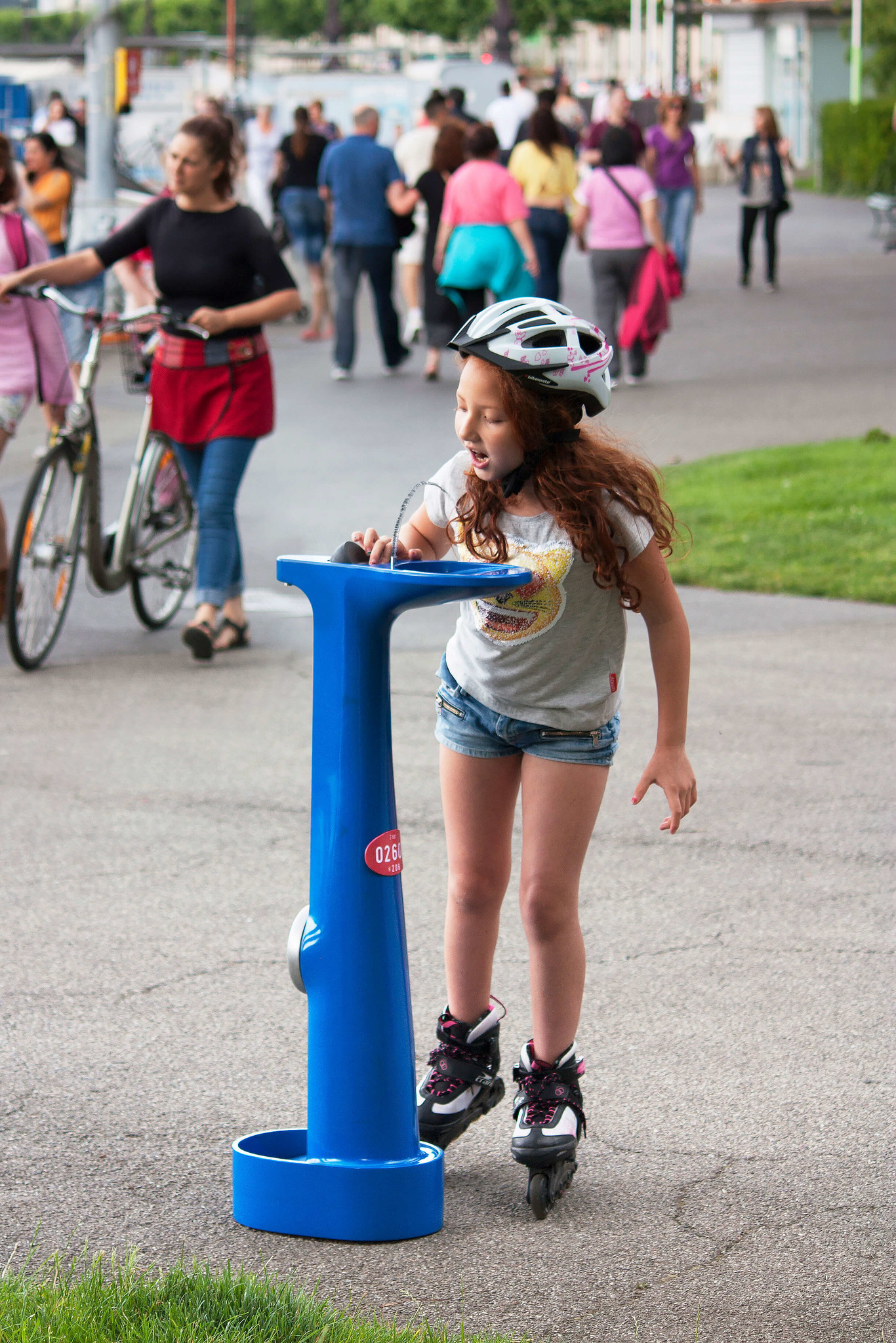
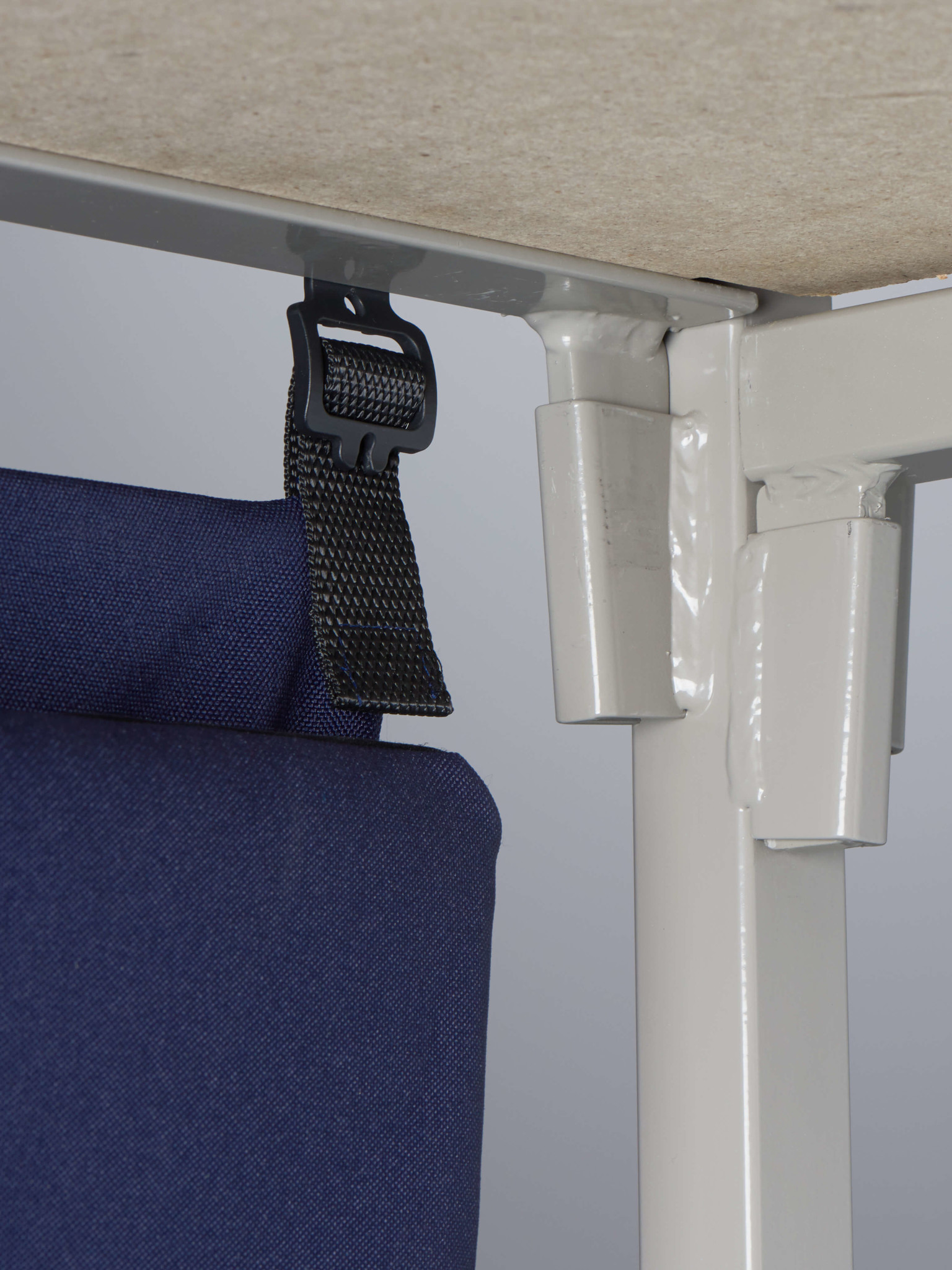
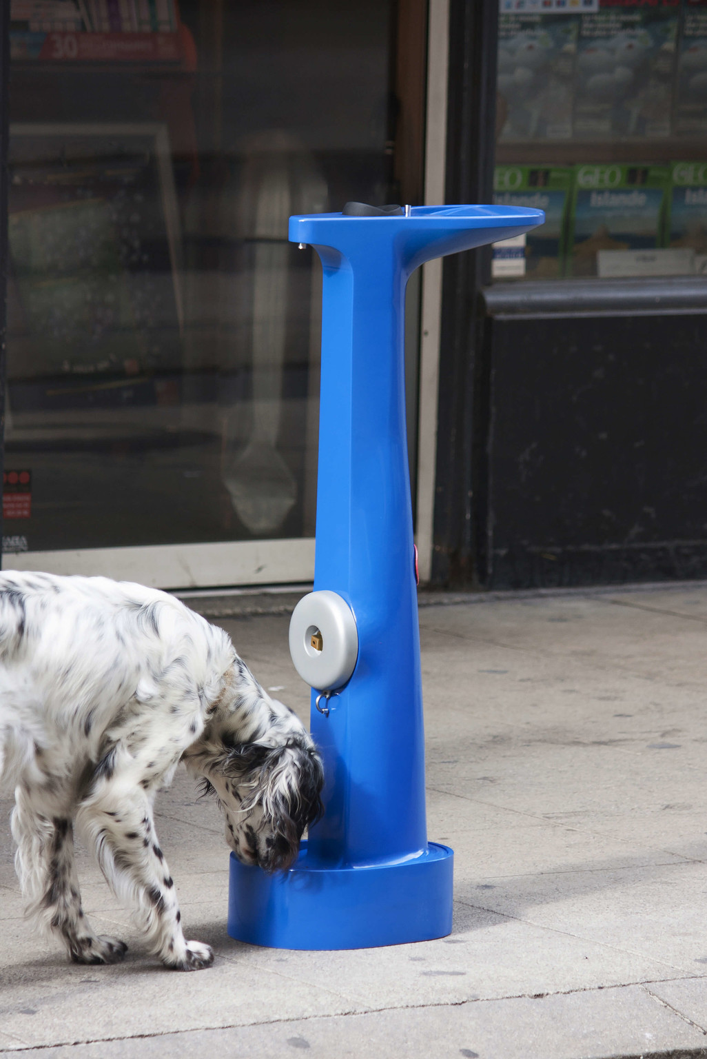
The cross-sections and plans of Dimitri Nassisi’s Drinking Hydrant fountains, along with a small number of photos showing them in use, suggest that they are on the verge of being implemented. Essentially, the project issues a demand — a challenge — that is political in nature: free access to drinking water at all times for every human and animal using the city — a right that is not guaranteed today. Zurich has a history in this area, as do Paris, where the water network was brought back into public ownership in 2008, and Rome, with its celebrated “nasoni” drinking fountains. All these networks are the outcome of political decisions that are deeply embedded in the respective city’s history. In this sense, Dimitri’s work can be seen as an encouragement, appeal, or accelerator for a right that should be as self-evident as his images. While at first glance Iskander Guetta’s Abri+ project also looks like a functionalist response to a socio-political problem, there is a strange and even unsettling dimension to his images: by formulating his response using the means of industrial design, without judgement and to the best of his ability, Guetta takes the argument that standardised industry can meet every person’s need to make a home for themselves even in the midst of disaster and pushes it to absurd lengths. It soon becomes clear that accommodation for displaced people can only be conceived of in functionalist terms. Ultimately, what interests me most about this project is a small piece, a connector, like a bud, that allows the new system to implant itself and develop almost organically on the host structure. That structure — the tradition of Swiss nuclear shelters — becomes the vehicle for a new history, a new form of hospitality that takes account of people’s dignity.
Ainsi, les coupes et les plans des fontaines Drinking Hydrant de Dimitri Nassisi, autant que les quelques photos les montrant en usage, nous laissent présager une implémentation imminente. Au fond, le projet lance une demande, un défi, d’ordre politique : l’accès à l’eau potable, gratuitement et en tout temps, pour tous les usagers de la ville – humains et animaux. L’accès à l’eau potable gratuite en zone métropolitaine n’est effectivement pas un droit garanti. Zürich a dans ce sens un projet historiquement situé ; la mairie de Paris a racheté son réseau d’eau en 2008 ; Rome a ses célèbres Fontanella ou « Nasone ». Or, tous ces réseaux sont le résultat de décisions politiques, profondément ancrées dans l’histoire de la ville. Dans ce sens, le travail de Dimitri apparaît comme un encouragement, un appel, un accélérateur d’un droit qui devrait être aussi évident que le sont ses images. Si, de prime abord, le projet Abri+ d’Iskander Guetta présente également une réponse fonctionnaliste à un problème socio-politique, une dimension étrange – même gênante, émane de ses images : en répondant par les moyens du design industriel, sans jugement et du mieux qu’il peut, Guetta pousse à l’absurde l’argument que l’industrie standardisée peut répondre, dans l’urgence de la catastrophe, au besoin de chacun de créer son habitat. Il apparaît bientôt évident que l’accueil de personnes déplacées ne peut être pensé qu’en termes fonctionnalistes. En fin de compte, ce qui m’intrigue le plus dans ce projet est une petite pièce, un connecteur, semblable à un bourgeon, qui permet au nouveau système de s’implanter et de se développer quasi organiquement sur la structure porteuse. La structure, la tradition des abris antiatomiques suisses, devient porteuse d’une nouvelle histoire, d’une nouvelle forme d’accueil qui prend en compte la dignité des personnes.
Ultimately, what interests me most about this project is a small piece, a connector, like a bud, that allows the new system to implant itself and develop almost organically on the host structure.
En fin de compte, ce qui m’intrigue le plus dans ce projet est une petite pièce, un connecteur, semblable à un bourgeon, qui permet au nouveau système de s’implanter et de se développer quasi organiquement sur la structure porteuse.
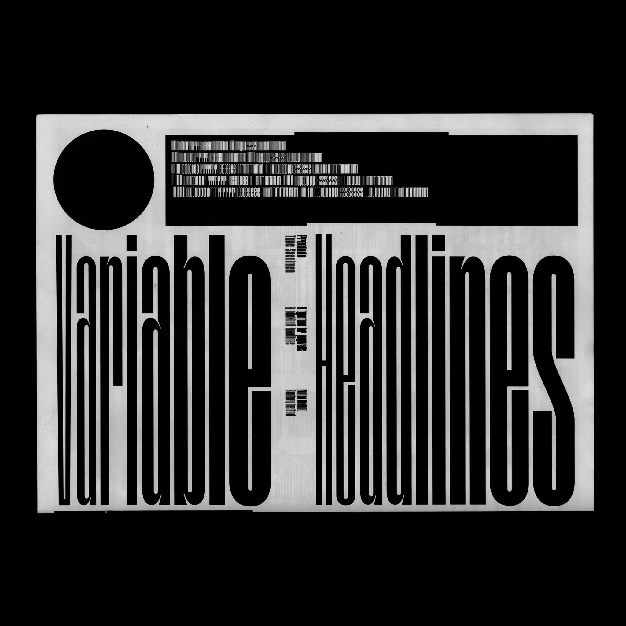
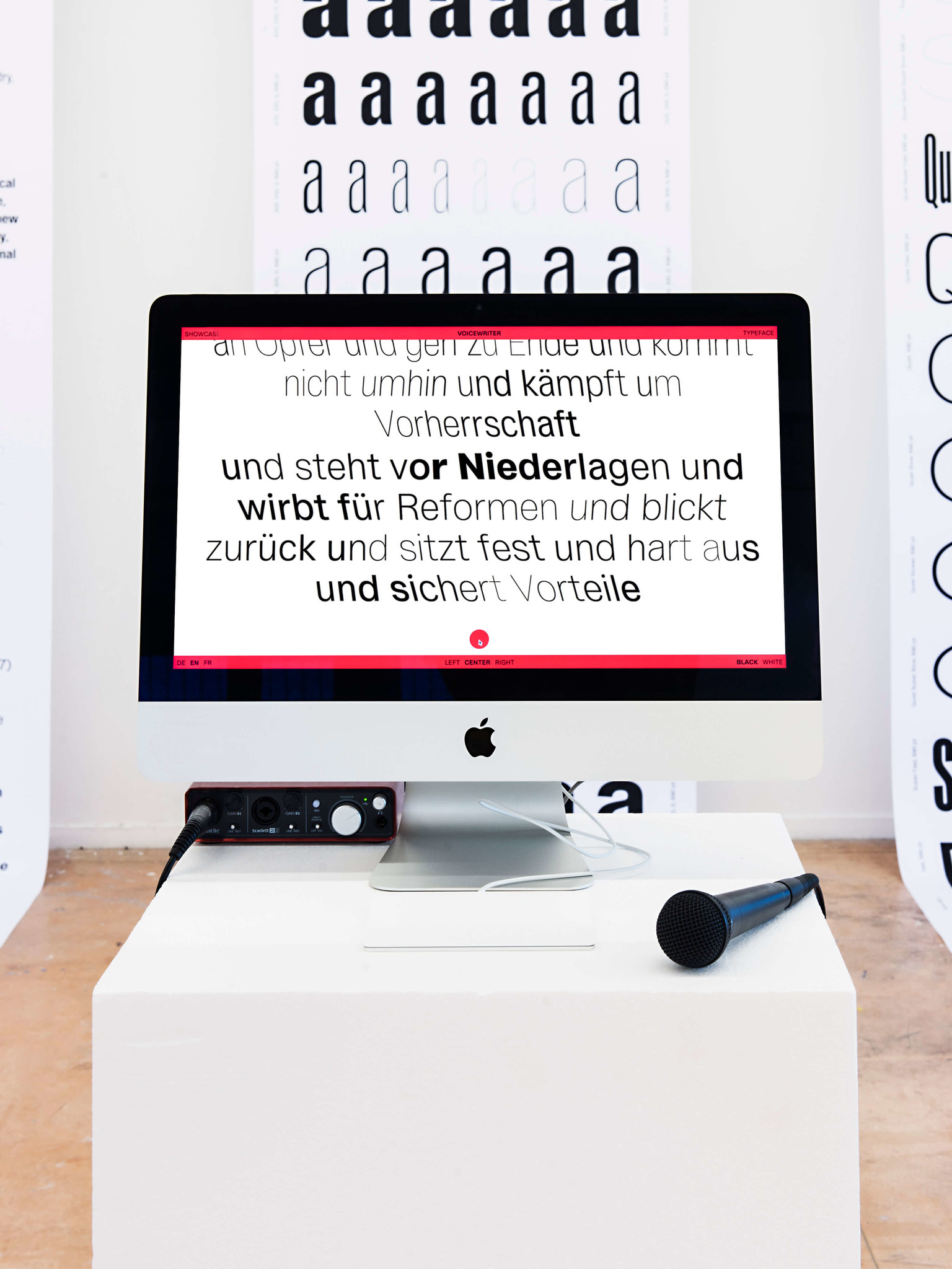
Cultural artefacts — especially minor ones as Walter Benjamin uses the term — both capture their times and are shaped by them. Benjamin collected toys and postcards, mapping out in them the dreams of a future, like a rag-picker foraging through the debris of history. Typefaces lend themselves well to this exploration; and when Mateo Broillet looks to them in his search for the spirit of science fiction, he also sees slippage“It is also interesting to note that this aesthetic is appropriated by actual examples, such as the visual identity of the Spanish national police that is also inspired by the imaginary of science fiction.” Mateo Broillet from one register to another that opens the door for some strange confusions. While typefaces can become explicit vehicles of history, as in the Typefaces for women against Hitler project, Broillet’s use of the variable web font Preciado (“precious” in Spanish) discreetly highlights the issues of accessibility and volatility of values in the internet. In Voicewriter, Sylvan Lanz explores another way of giving shape to expression that zooms down to the scale of the singular. Using developments in information technology, Lanz sets out to capture the modulation of the human voice. His aim is not to identify the person but to render or convey what they express without actually saying it — the way in which the spoken word is transformed into letters. Given the huge advances in means of identification, this displacement seems to me particularly important, inasmuch as it asks us to register not the identity of a voice but the way in which that voice says something, the affect at work within the voice.
Les artefacts culturels, surtout les formes dites « mineures » – au sens où les entend Walter Benjamin – , capturent leur époque et en portent l’empreinte. Collectionneur de jouets et de cartes postales, Benjamin y traque les rêves d’avenir, comme un chiffonnier dans les restes de l’histoire. Les polices d’écriture se prêtent bien à cette exploration et, quand Mateo Broillet cherche l’esprit de la science-fiction dans celles-ci, il observe aussi les glissements« Il est également intéressant de voir que cette esthétique est appropriée par des exemples concrets, comme l’identité visuelle du corps national de police espagnol, également inspiré par cet imaginaire de la science-fiction. » Mateo Broillet d’un registre à un autre, ouvrant la voie à d’étranges confusions. Tandis que des polices d’écriture peuvent devenir les porteurs explicites de l’histoire, comme dans le projet Typefaces for women against Hitler, Broillet pointe discrètement, avec la police d’écriture variable de titrage Preciado (« précieux » en espagnol), sur les question d’accessibilité et de volatilité des valeurs sur internet. Avec Voicewriter, Sylvan Lanz explore une autre voie pour la mise en forme de l’expression, descendant à l’échelle du singulier. Prenant en compte les développements informatiques, Lanz cherche à capturer la modulation de la voix. Il ne s’agit pas d’identifier la personne, mais de rendre, de transporter, ce qu’elle exprime sans le dire – de montrer comment la voix devient lettre. A l’aune du développement massif des moyens d’identification, ce déplacement me semble particulièrement important à relever, en tant que ce qui est à noter n’est pas l’identité d’une voix, mais comment cette voix dit quelque chose et l’affect qui est à l’oeuvre dans la voix.
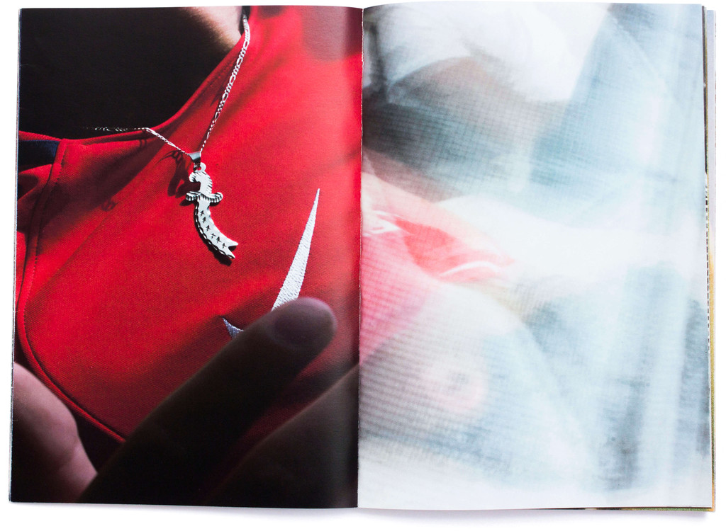
The omnipresent and hyper-accessible technology of photography becomes the ideal medium for communities to invent and reflect on the ways in which they are represented. This is where Solène Gün’s“It was very important for me to involve myself in their daily lives in order to re-transcribe them in images and bring an immersive vision to the subject which also allows us to get away from the stereotypes we may have about immigration.” Solène Gün work comes in: sketching out models in which young people feel valorised and can project themselves into a desirable future, countering the clichés and the abstract and violent models produced by commercial media, such as Suburra or Dogs of Berlin.Two series produced by Netflix, the western world’s giant of on-demand video. At the opposite extreme of photographic approaches to current realities, Virginie Rebetez explores the genre of the “photographic survey” and its attendant values of truth and objectivity, as testimony to an age that is heading towards the future, an archive; and at that very point, introduces what is ignored or dismissed. Perhaps she is seeking to give form to what is repressed and make space for something that is already amongst us. That, in any event, is what’s at stake when she embarks on her photographic survey of the tradition of mediums and healers. Rebetez opens up a perspective that embraces a plurality of co-existing presents rather than a single and exclusive narrative space.
La photographie, technologie omniprésente et archiaccessible, devient le moyen idéal pour des communautés pour inventer et réfléchir à leurs représentations. C’est là où se situe le travail de Solène Gün :« Il était très important pour moi de m’introduire dans leur quotidien afin de le restranscrire en image et d’apporter une vision immersive du sujet qui permet ainsi de sortir des stéréotypes que nous pouvons avoir sur l’immigration. » Solène Gün esquisser des modèles, dans lesquels les jeunes gens se sentent valorisés, peuvent choisir leurs positions et se projeter dans un avenir désirable, contre des clichés et des modèles abstraits et violents produit par les médias commerciaux, comme par exemple Suburra ou Dogs of Berlin.Deux séries produite par Netflix, géant occidental de la vidéo sur demande. A l’autre bout de l’arc des approches photographiques enquêtant sur les réalités en cours, Virginie Rebetez investit le genre de « l’enquête photographique », auquel est attachée une valeur de vérité et d’objectivité : un témoignage d’une époque en cours, à l’adresse du futur, une archive. Et, précisément là, introduire ce qui est ignoré, écarté. Peut-être qu’il s’agit de donner une forme au refoulé, et donner une place à ce qui est déjà toujours parmi nous. C’est ce que fait Rebetez quand elle propose d’enquêter sur la tradition des médiums et des guérisseurs par les moyens de la photographie. La perspective ouverte est celle d’accepter une pluralité de présents coexistants, plutôt qu’un espace narratif unique et exclusif.
Perhaps she is seeking to give form to what is repressed and make space for something that is already amongst us.
Et, précisément là, introduire ce qui est ignoré, écarté. Peut-être qu’il s’agit de donner une forme au refoulé, et donner une place à ce qui est déjà toujours parmi nous.
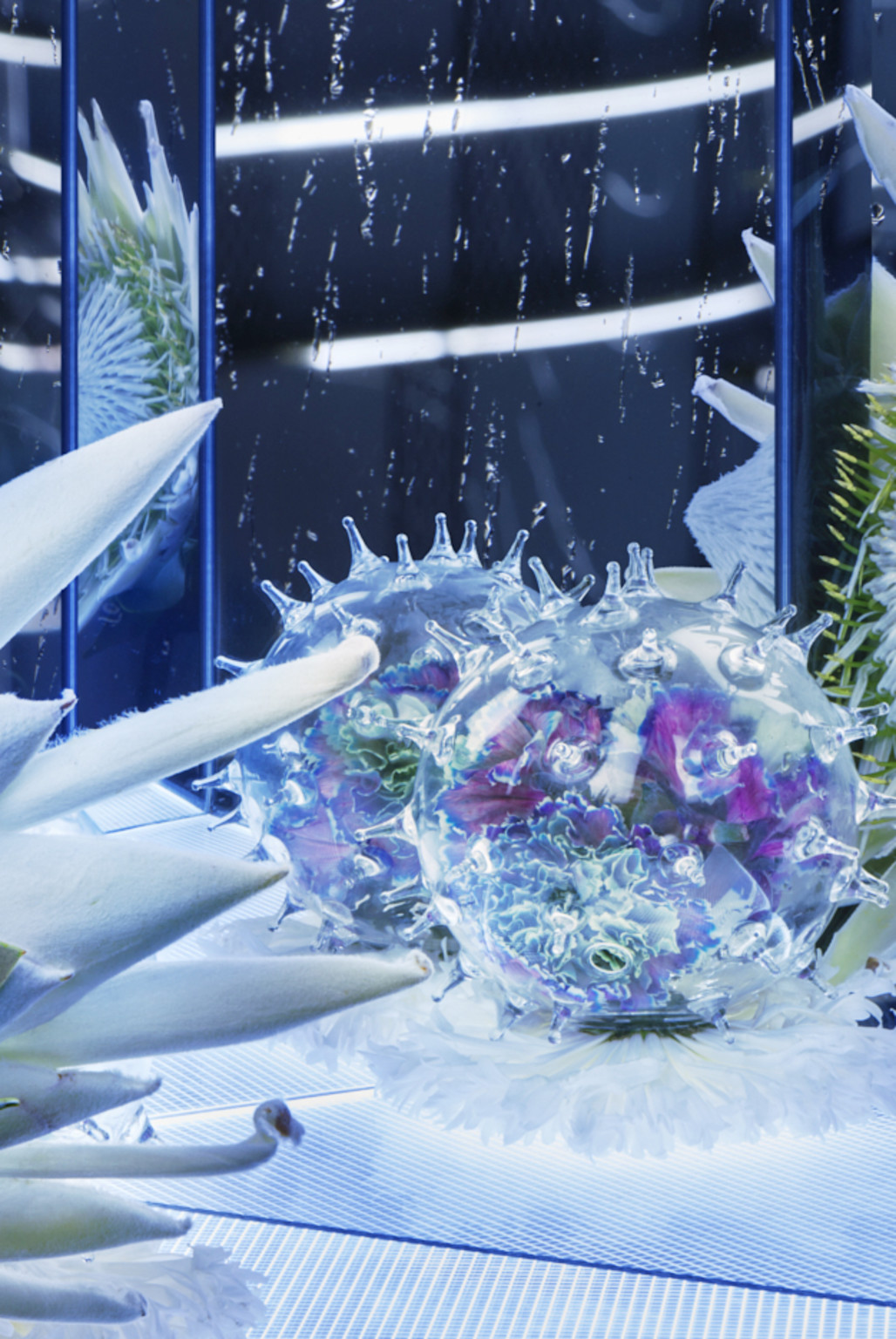
This active plurality is also found in the illustrations of Alina Günter, which are based on very familiar objects. Their analogue character comes as a surprise, appearing anachronistic amid the flood of consumed images. The illustrator’s pared-down and simplified designs seem pregnant with meaning, like eggs about to hatch“In my work, I try to find images that have an additional dimension alongside their primary function as illustrations for a text or a product: images that evoke a polysemic narration, are unusual and yet retain a simplicity. I’m always looking for the tension between reduction in the drafting and complexity in the content.” Anina Arter, a semantic storm on the verge of breaking.
Cette pluralité en œuvre se trouve aussi dans les illustrations d’Alina Günter, basées sur des objets parfaitement connus. Anachronique dans le flot de la consommation d’image, le caractère analogique surprend. Les dessins épurés et simplifiés de l’illustratrice semblent gros de sens, comme des œufs sur le point d’éclore,“Ich versuche in meiner Arbeit Bilder zu finden, die neben ihrer vordergründigen Funktion als Illustration eines Textes oder Produktes noch eine zusätzliche Dimension aufweisen. Bilder, die eine mehrdeutige Narration evozieren, merkwürdig sind und trotzdem eine Einfachheit behalten. Ich suche stets das Spannungsfeld zwischen der Reduktion in der Zeichnung und der Komplexität des Inhaltes.” Anina Arter comme une tempête sémantique sur le point de se déchaîner.
The illustrator’s pared-down and simplified designs seem pregnant with meaning, like eggs about to hatch, a semantic storm on the verge of breaking.
Les dessins épurés et simplifiés de l’illustratrice semblent gros de sens, comme des œufs sur le point d’éclore, comme une tempête sémantique sur le point de se déchaîner.

Conversely, the photographs of Quentin Lacombe invite us to imagine the far reaches of space but ultimately prompt us to recompose a different world from clues that are familiar to us. The architectures and textures he creates hover on the verge of unrecognisability, prompting us to slip between scales, inviting us to deploy our capacity to imagine something that has not yet come into being. In a similar register, the tapestries of Anina Arter, often based on plant motifs in which scientific drawing blends with the universe of Where the Wild Things Are,Children’s book by Maurice Sendak likewise create a world of their own. Indeed, Arter’s prints literally wrap their occupants, as it were endowing them with the gift of ubiquity, inviting them to imagine being simultaneously here and elsewhere.
Les images de Quentin Lacombe semblent en totale opposition à cette dernière conception. Si elles nous invitent à imaginer le fin fond de l’espace, elles nous ramènent, en fin de compte, à recomposer un monde autre à partir d’indices de ce que nous connaissons. Les architectures et textures créées par le photographe, à la limite de ce qu’on peut reconnaître, nous font glisser dans les échelles, nous invitant à mettre en œuvre nos capacités à imaginer ce qui n’est pas encore. Dans un registre semblable, les tapisseries d’Anina Arter, souvent basées sur des motifs végétaux où le dessin scientifique se mélange avec l’univers de Max et les maximonstres,Livre pour enfant de Maurice Sendak font également monde. De fait, littéralement, les imprimés d’Arter emballent l’habitant – et lui donne une espèce de don d’ubiquité, une invitation à s’imaginer ici et ailleurs en même temps.
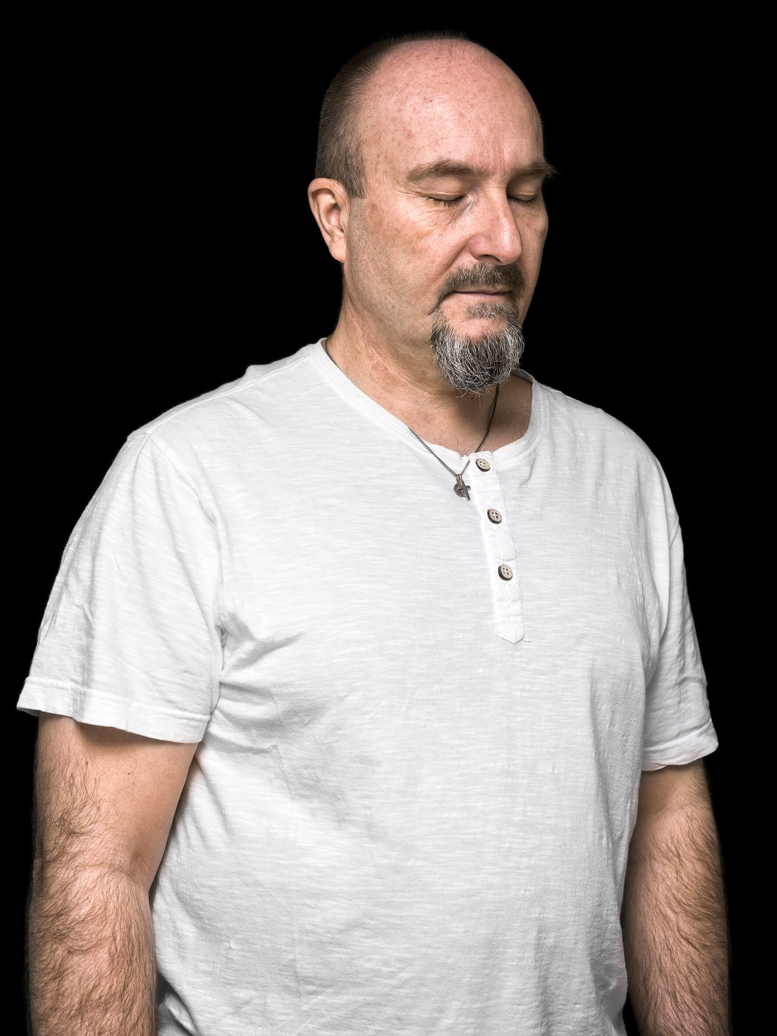
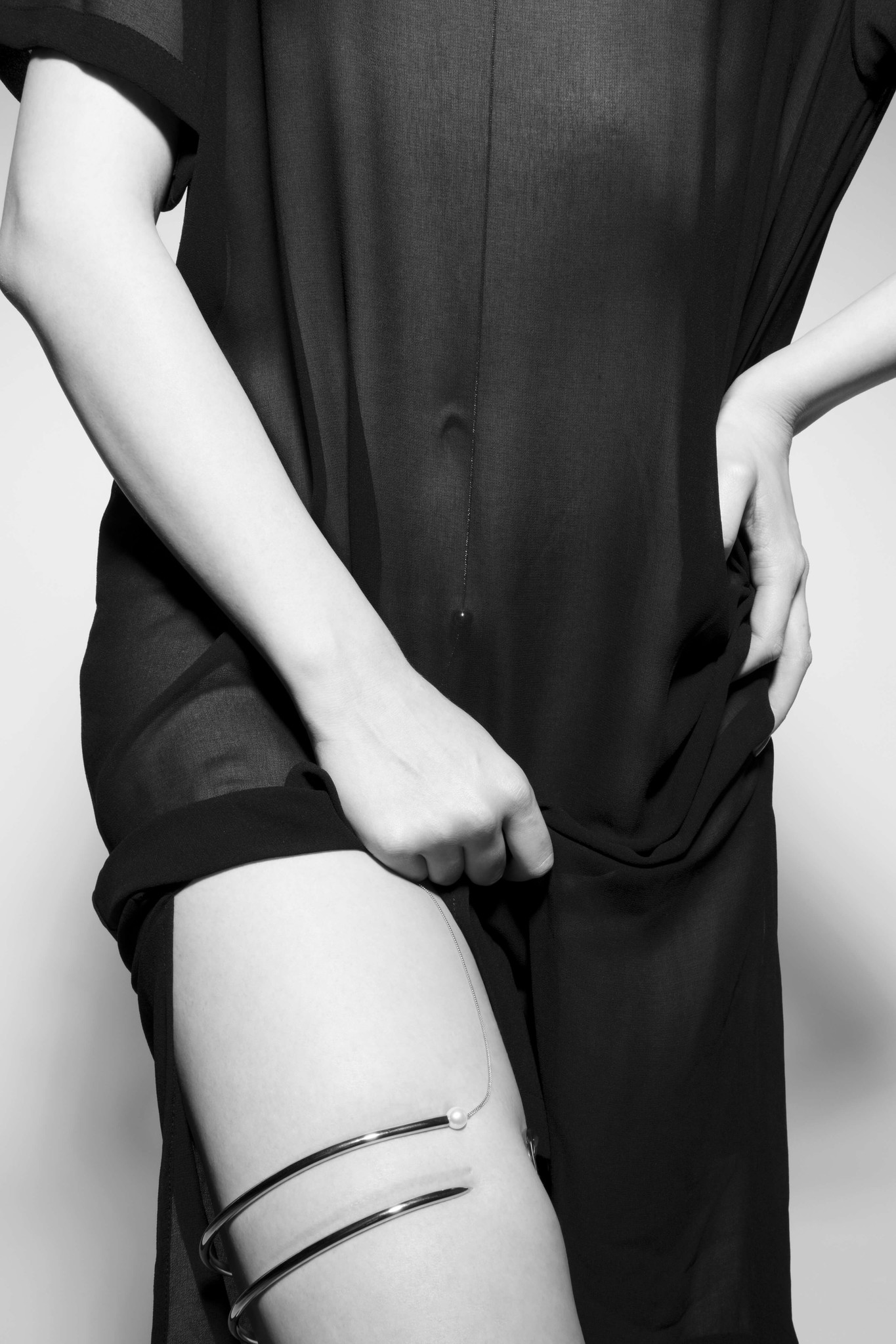
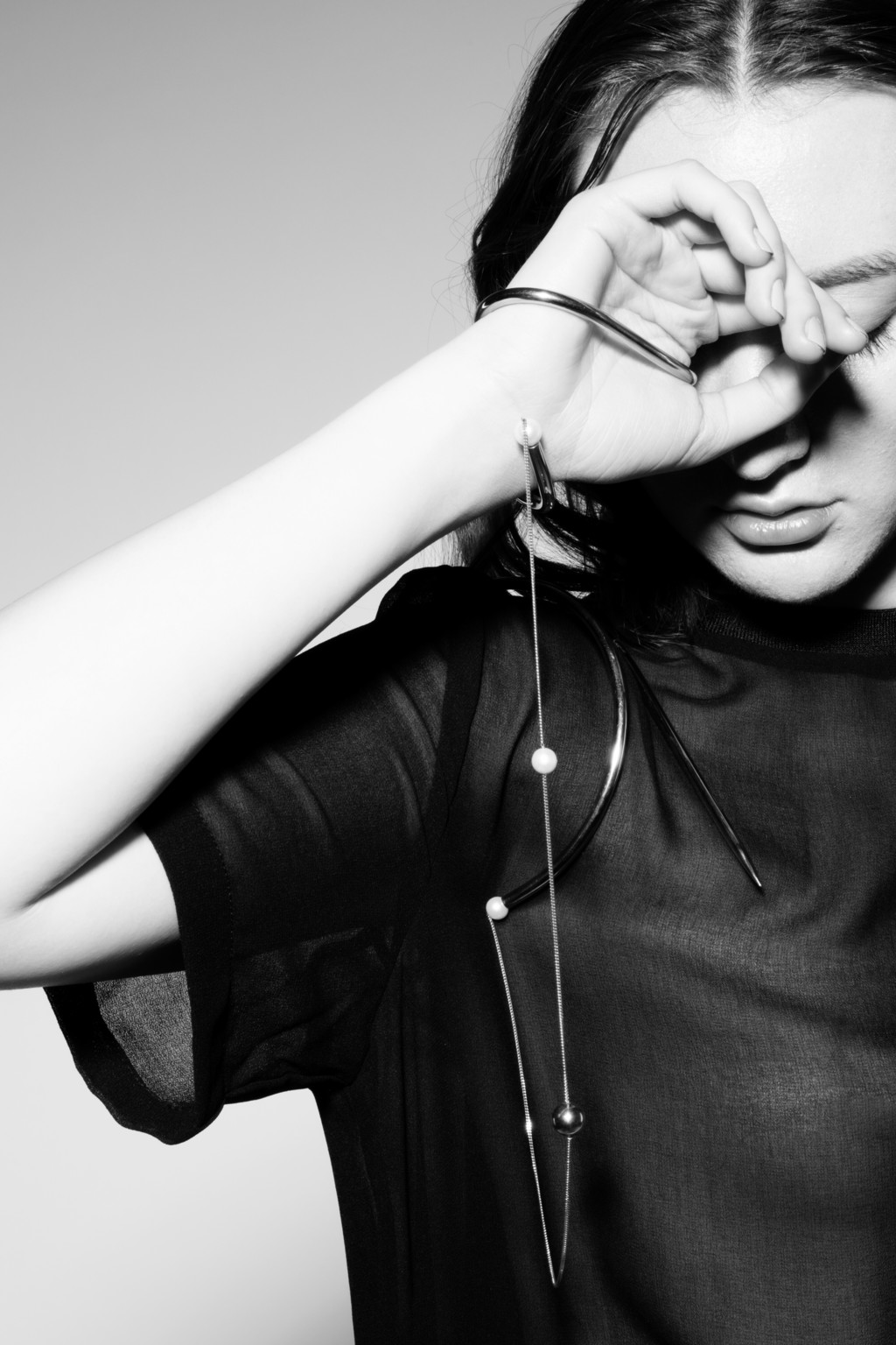
Pinning down the function of Noemi Niederhauser’s group of objects, by contrast, would be a far from easy task. While they are undeniably decorative, that is not sufficient in and of itself. The abstruse title T’as fatigué la salade? might just as well come from a dialogue between the designer’s objects, the “salad” being quite simply what takes the place of thoughts in our overstimulated brains. So the group of objects offers“The product of an extended engagement with the marks and details that emerge during the creative process, ‘T’as fatigué la salade?’ remains a prototype that is constantly invoked. Blending handicraft with industrial processes, each object is an anomaly, liberated from static redundancy. ‘T’as fatigué la salade?’ is dedicated to the rhythmic oscillations of light, sun and darkness, activity and repose, work and recovery. Neither identical nor neutralised, long periods of uncertainty are written into the project’s final appearance. Could it be that waking up to platitude and rampant standardisation means finally going to sleep?” Noémi Niederhauser a kind of divestment of the self, enjoining us to inhabit those moments in which prototypes of unfinished selves are sketched out. Other objects, by contrast, invite us to discreetly remind the body of its existence in the everyday. The — literally — intimate jewellery of Joanne Guiraud is concerned with the representation of the body not for others, but for the self. Typically hidden beneath clothing, these decorations produce sensations of pinching, scratching, caressing and tingling. The sensuality thus evoked is aware, exploratory, reminding us that pleasure is probably not to be found in comfort. Well-being is thus displaced towards embracing sensations rather than dulling them down.
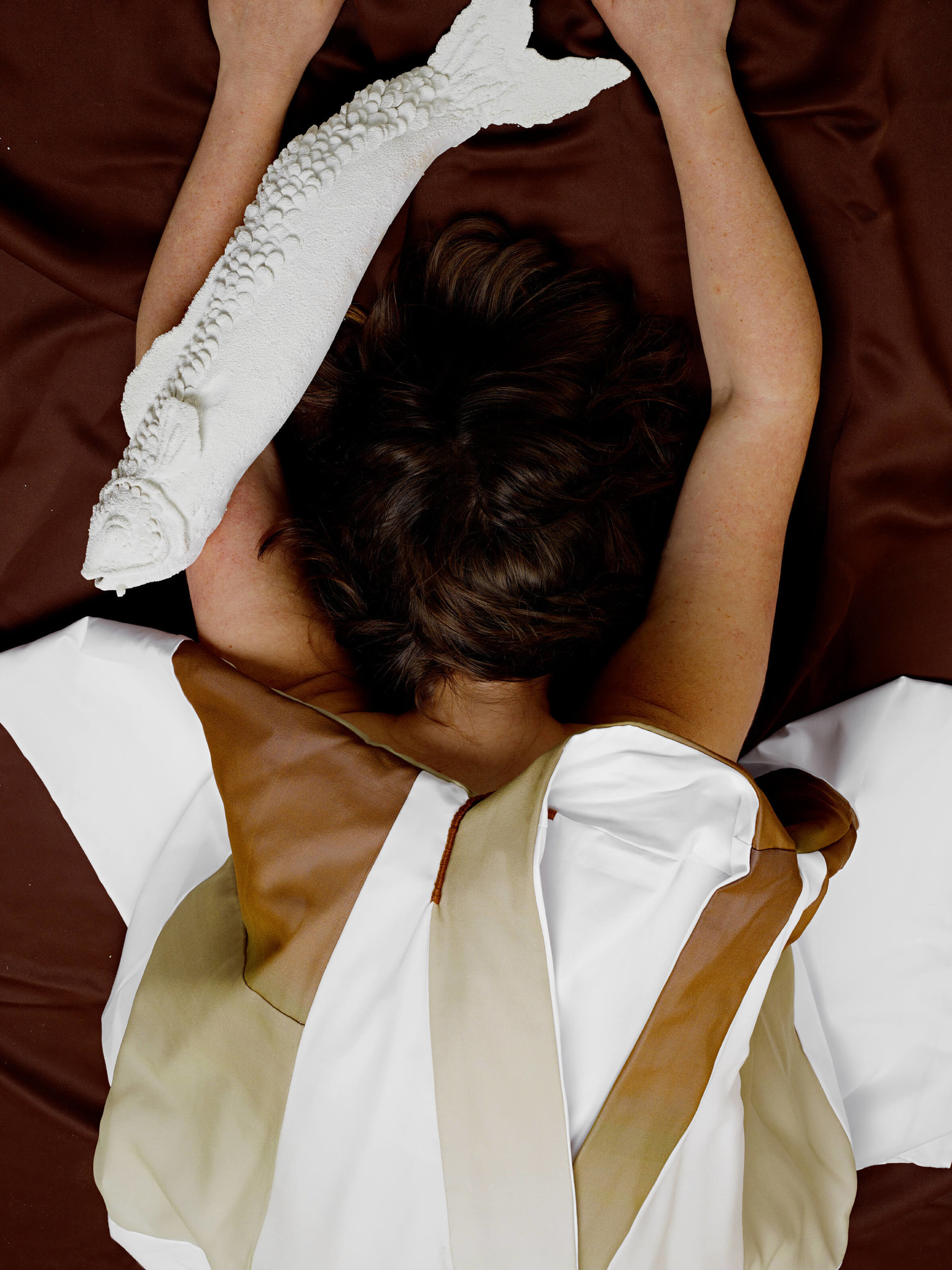
On se trouverait par contre bien embarrassé si l’on devait décrire la fonction du groupe d’objets de Noemi Niederhauser. Oui, la fonction décorative s’applique, mais n’est pas suffisante. Le titre abscons T’as fatigué la salade pourrait bien être tiré d’un dialogue entre les objets de la designer, la « salade » n’étant autre que celle qui se trouve à la place des pensées, dans nos cerveaux surstimulés. Ainsi le groupe d’objets propose«Résultat d’une attention prolongée aux traces et détails qui émergent tout au long du processus de création, « T’as fatigué la salade » reste en état de prototype permanent revendiqué. Entremêlant travail de la main et procédés industriels, chaque objet est une anomalie, émancipé d’une redondance statique. « T’as fatigué la salade? » est dédié aux oscillations rythmiques de la lumière, du soleil et de l’obscurité, de l’activité et du repos, du travail et de la récupération. Non identiques, non neutralisés ; des temps longs et incertains s’inscrivent dans l’apparence finale de ce projet. Se réveiller face à une platitude et uniformisation rampante serait-ce finalement dormir? » Noémi Niederhauser une forme de désinvestissement du soi, et suggère d’habiter ces moments où s’ébauchent des prototypes de « soi » inachevés. D’autres objets offrent à l’inverse de rappeler discrètement au corps son existence dans le quotidien. Les bijoux littéralement intimes de Joanne Guiraud ne s’adressent pas à la représentation du corps desles autres, mais à lui-même. Pincements, grattements, caresses, picotements sont les effets de ces bijoux qui se cachent volontiers sous les vêtements. La sensualité devient ainsi consciente, exploratrice, rappelant que la jouissance ne se trouve probablement pas dans le confort. Ainsi, le bien-être se trouve déplacé dans un investissement des sensations, plutôt que dans leur aplanissement.
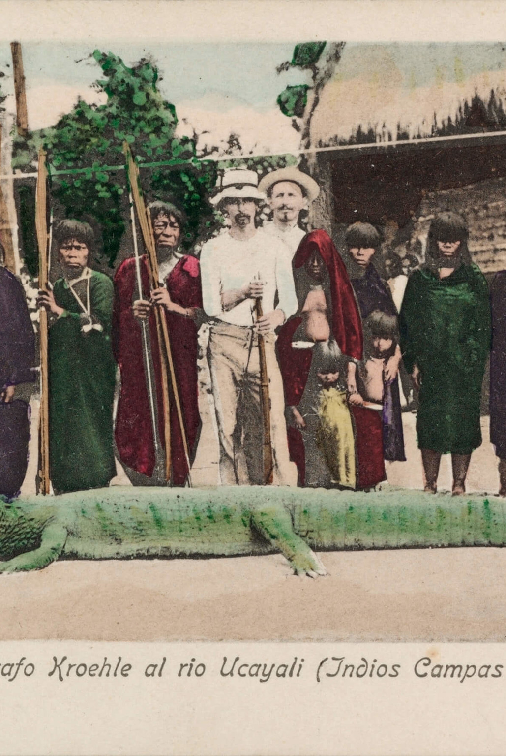
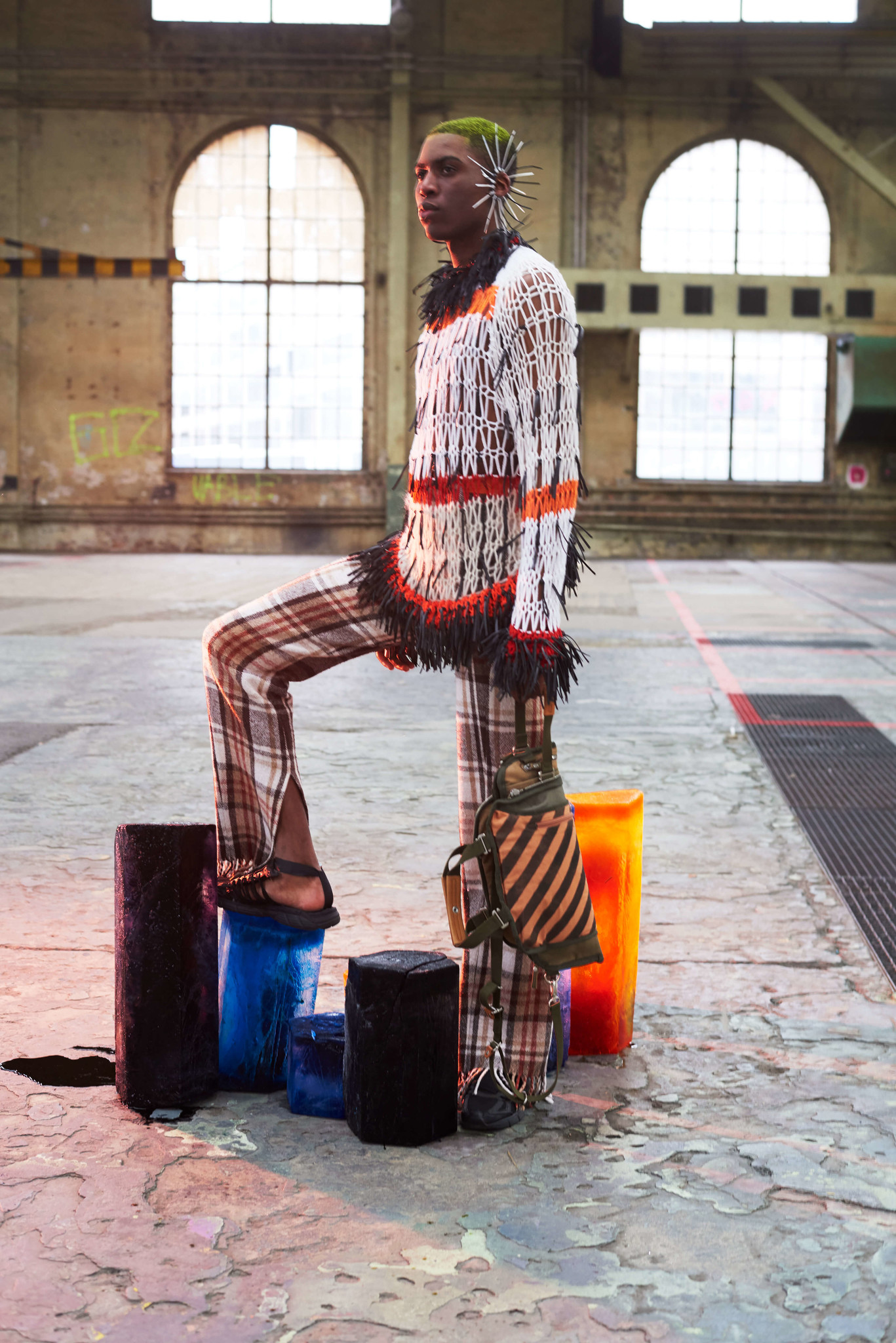
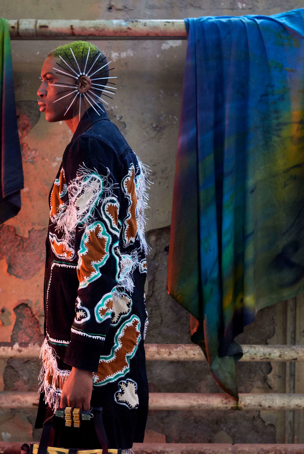
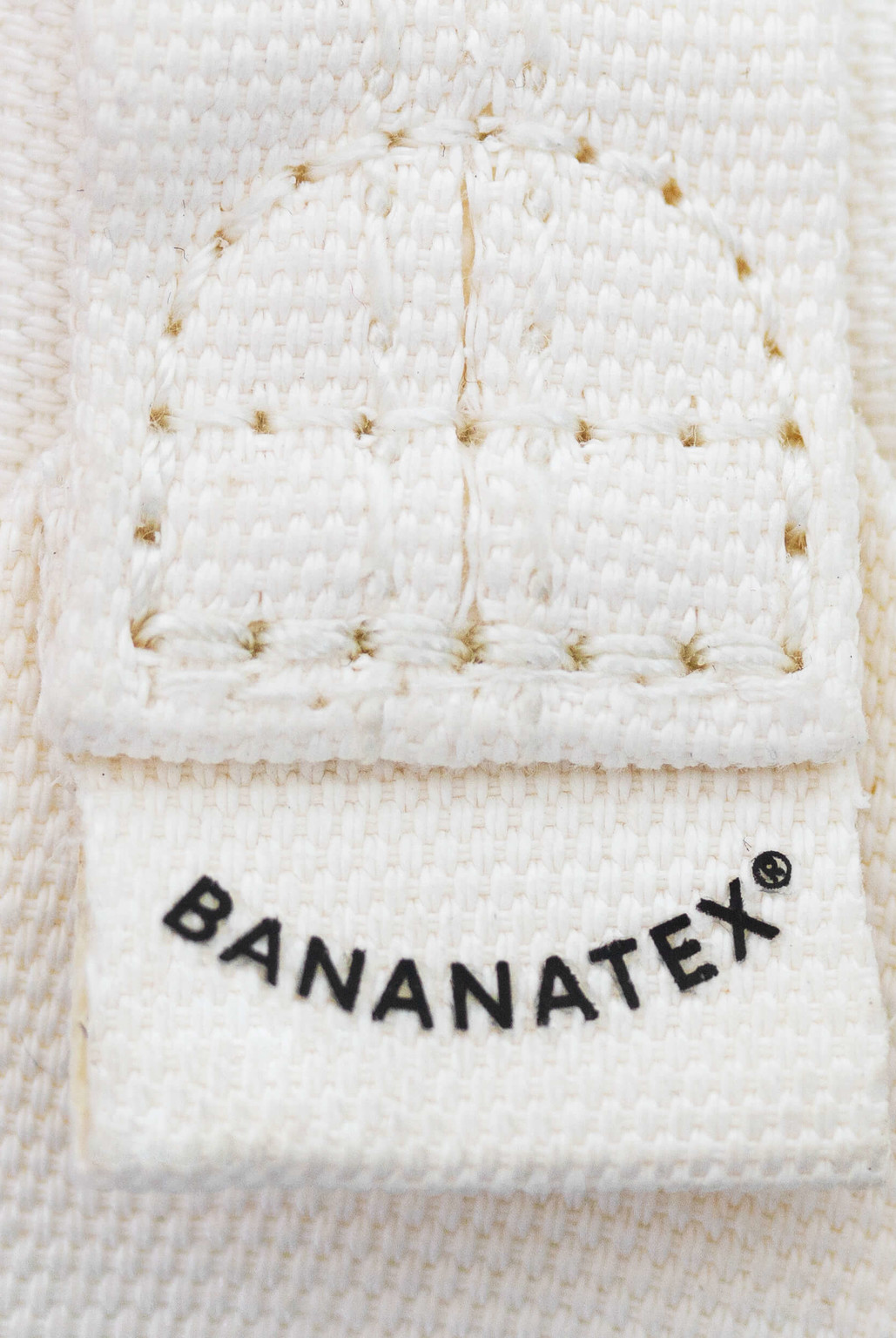
Gross and Escandõn conduct the same experiment with their photographic project Aya. Taking as their starting point the biography of a European photographer who disappeared in the Peruvian Amazon reconstructed from archives — an established documentary practice — the duo literally sink into their investigation, immersing themselves, becoming part of the place they invest, extending their immersion beyond the limit of consciousness. Their images are no longer images of the place, but places in their own right, places that are moving, in a trance. Quite different and yet not so remote, Julia Seemann explores subcultures as loci of trance. Her most recent collection is a journey through the world of rave and trance. It exudes a sense of the ahistorical that is resistant to the contemporary and almost ghost-like. The reverse of “timeless classicism”, her creations are marked by history, located in time. They thus reject the illusion of novelty as such and enjoin us to go back. What returns is a spirit that is at once delicate and powerful, that always disappears very quickly, but invariably returns; a spirit that is struggling, celebrating, a collective spirit that Seemann remodels in each of her collections. Rafael Kouto’s project doesn’t simply draw on the “African” model of upcycling: it creates a veritable machine for the imagination. His work reminds me of Raymond Roussel’s Impressions d’Afrique, in which the writer serves up minutely detailed descriptions of festivals and rituals that turn out to be entirely fictional. Roussel allows his readers to tap into a “fashionable”, available collective imaginary, only to set them in motion, invite them to continue the work of collective imagination and activate that capacity to conceive a different world. Except that in Kouto’s case, the implementation is woven into the material and the whole production chain that, as in the collaboration“[…], using natural fibers is no walk in the park and sustainable production methods like dyeing with OekoTex100 Standard pose new challenges. Colours may fade over time, as colour fastness is lower than with other, less sustainable processes. Our natural materials develop a patina with time and wear, just like a good pair of jeans do. In the past, this has surprised some of our customers, and led them to return bags for aesthetic reasons: namely that their bag’s appearance changed after some time in use. These used and returned bags were the material and the starting point of our collaboration with Rafael Kouto.” with Qwstion, brings a whole world with it.
C’est aussi l’expérience que nous propose Gross and Escandõn avec leur projet Aya. En partant de la biographie, basée sur des archives, d’un photographe européen disparu dans l’amazone péruvien, une pratique documentaire établie, les deux photographes vont littéralement s’enfoncer dans leur enquête, s’immergeant, devenant part du lieu investi, prolongeant l’immersion au-delà de la limite de la conscience. Leurs images ne sont plus des images du lieu, mais des lieux elles-mêmes, des lieux en déplacement, des lieux en transe. Dans une démarche différente mais pas très éloignée, Julia Seemann explore les sous-cultures comme lieux de la transe. La dernière collection traverse l’univers de la rave et de la trance. De sa collection émane une sensation anhistorique, résistante au contemporain, presque fantomatique. A l’inverse du « classique intemporel », ses créations sont marquées par l’histoire, situées dans le temps. Ce faisant elles refusent l’illusion du nouveau en soi et revendiquent un retour au passé. Ce qui revient, c’est un esprit, délicat et puissant à la fois. Il disparaît toujours très vite, mais revient toujours. Un esprit en lutte, un esprit en fête, un esprit collectif que Seeman remodélise dans chacune de ses collections. Quant au modèle développé par Rafael Kouto, qui ne s’inspire pas seulement du modèle « africain » mais crée une réelle machine à imaginer. Son travail me rappelle les Impressions d’Afrique de Raymond Roussel. Dans ce livre, Roussel fait des descriptions infiniment détaillées de scènes de fêtes et de rituels. Cependant, celles-ci sont complètement fictives. Roussel branche le lecteur sur un imaginaire collectif disponible, « dans l’air du temps »,Aussi problématique soit-il aujourd'hui. La fascination pour l'Afrique dont se sert Roussel à l'époque n'est aujourd’hui pas acceptable en ce qu'elle réduit une partie du monde à une projection. Dans ce sens, le projet de Kouto est tout à fait juste, faisant fonctionner la machine à projection quasiment à rebours. pour le mettre en mouvement, l’inviter à poursuivre son travail d’imagination collective et entraîner cette capacité à imaginer un autre monde possible. Cependant, avec Kouto, la mise en œuvre se tisse dans la matière et toute la chaîne de production, comme dans la collaboration“[…], using natural fibers is no walk in the park and sustainable production methods like dyeing with OekoTex100 Standard pose new challenges. Colours may fade over time, as colour fastness is lower than with other, less sustainable processes. Our natural materials develop a patina with time and wear, just like a good pair of jeans do. In the past, this has surprised some of our customers, and led them to return bags for aesthetic reasons: namely that their bag’s appearance changed after some time in use. These used and returned bags were the material and the starting point of our collaboration with Rafael Kouto.” avec Qwstion, entraînant tout un monde avec lui.
They thus reject the illusion of novelty as such and enjoin us to go back. What returns is a spirit that is at once delicate and powerful, that always disappears very quickly, but invariably returns;
Ce faisant elles refusent l’illusion du nouveau en soi et revendiquent un retour au passé. Ce qui revient, c’est un esprit, délicat et puissant à la fois. Il disparaît toujours très vite, mais revient toujours.
After this perambulation through a heterogeneous ensemble of practices located in realities that are often far apart, I come to the work of common-interest and their exhibition for the graphic arts biennial in Sharjah. Their composition reminds me somewhat of the film Sur les sentiers de l’utopie,A film by Isabelle Grémaux and John Jordan in which the film-makers visit a series of utopian experiments while they are in progress. While the experiments themselves are intriguing, what is most striking in the end is the realisation that they are all taking place at the same time. The same is true of the realities brought together by common interest, making up an ensemble of inchoate realities that are part documentary, part engineering.
Après ce cheminement parmi un ensemble hétérogène de pratiques situées dans des réalités souvent distantes, j’en viens au travail de common-interest et à leur exposition pour la biennale des arts graphique de Sharjah. Leur travail de composition me rappelle d’une certaine manière le film Sur les sentiers de l’utopie.Un film d'Isabelle Grémaux et John Jordan Dans ce film, les réalisateurs rendent visite à une série d’expériences utopiques en cours. Si les expériences en soi sont intrigantes, ce qui est le plus frappant, en fin de compte, est de réaliser qu’elles se passent toutes en même temps. C’est également le cas des réalités rassemblées par common interest, composant un ensemble de réalités en devenir, entre documentaire et ingénierie.
This simultaneous nature of these practices demands our full attention. My rapid overview, which makes no claims to be complete, points to a multiplicity of inchoate worlds at work. Every designer is engaged, through their work, in developing a model of the world to come.
Cette simultanéité des pratiques retient toute notre attention. Ce rapide cheminement, sans aucune prétention d’exhaustivité, indique une multitude de mise en œuvre du monde en cours. Chaque designer est à l’œuvre et développe, par son travail, un modèle de monde à venir.
This simultaneous nature of these practices demands our full attention. My rapid overview, which makes no claims to be complete, points to a multiplicity of inchoate worlds at work. Every designer is engaged, through their work, in developing a model of the world to come. What I want to bring out is that there is no one single future, and there cannot be one model for all. On the contrary: it is our joint responsibility to do our best in every direction, to create and share models and fragments of realities, just as these designers are doing. Their works are not isolated: they are linked, articulated in chains of production, anchored by the functions they perform, modify and transform. These realities are connected, laid end to end without seeking closure. Those ends and assemblies are themselves caught up in networks of presentation. That, for me, is the true meaning of the Swiss Design Awards: as an exhibition of potential futures. I hope you enjoy your visit!
Cette simultanéité des pratiques retient toute notre attention. Ce rapide cheminement, sans aucune prétention d’exhaustivité, indique une multitude de mise en œuvre du monde en cours. Chaque designer est à l’œuvre et développe, par son travail, un modèle de monde à venir. L’argument que je veux faire valoir, c’est qu’il n’y a pas de futur unique, qu’il ne peut y avoir un modèle pour tous. Au contraire, nous avons comme responsabilité commune d’essayer de notre mieux et de toutes parts : créer et partager des modèles et des bouts de réalités, comme le font ces designers. Leurs travaux ne sont pas isolés, mais liés, articulés dans des chaînes de production, ancrés par les fonctions qu’ils remplissent, modifient et transforment. Ces réalités sont connectées, mises bout à bout, sans chercher de clôture. Ces bouts et ces assemblages sont eux-mêmes pris dans des réseaux de présentation – et c’est aussi dans ce dernier rôle que les Swiss Design Awards prennent leur sens : comme exposition d’avenirs possibles. Bonne visite !


You are using an outdated browser.
Please upgrade your browser to improve your experience.